FEATURED PROJECT
Case Study: Saint Solaire Sunscreen Advertising Campaign
Saint Solaire is reimagined as a luxury sun care brand through a refined visual identity and packaging system. The project is elevated with a cinematic AI-generated campaign that turns daily SPF into a lifestyle experience.

Role:
- Lead brand redesign and positioning
- Develop visual identity and packaging system
- Art direct AI-generated campaign videos
- Create visual frameworks and prompts for production
- Ensure consistency across brand and marketing assets
Outcome: A repositioned Saint Solaire as a premium sun care brand with a refined identity, elevated packaging, and a cinematic AI-driven campaign that strengthens its lifestyle appeal and market presence.
The project repositions Saint Solaire as a premium sun care brand through a refined visual identity and elevated packaging system.
An AI-generated cinematic campaign brings the brand to life through sun-drenched, lifestyle-driven storytelling across digital platforms.
Deliverables include the updated identity system, packaging design, and a modular video campaign built for scalable use.
FEATURED PROJECT
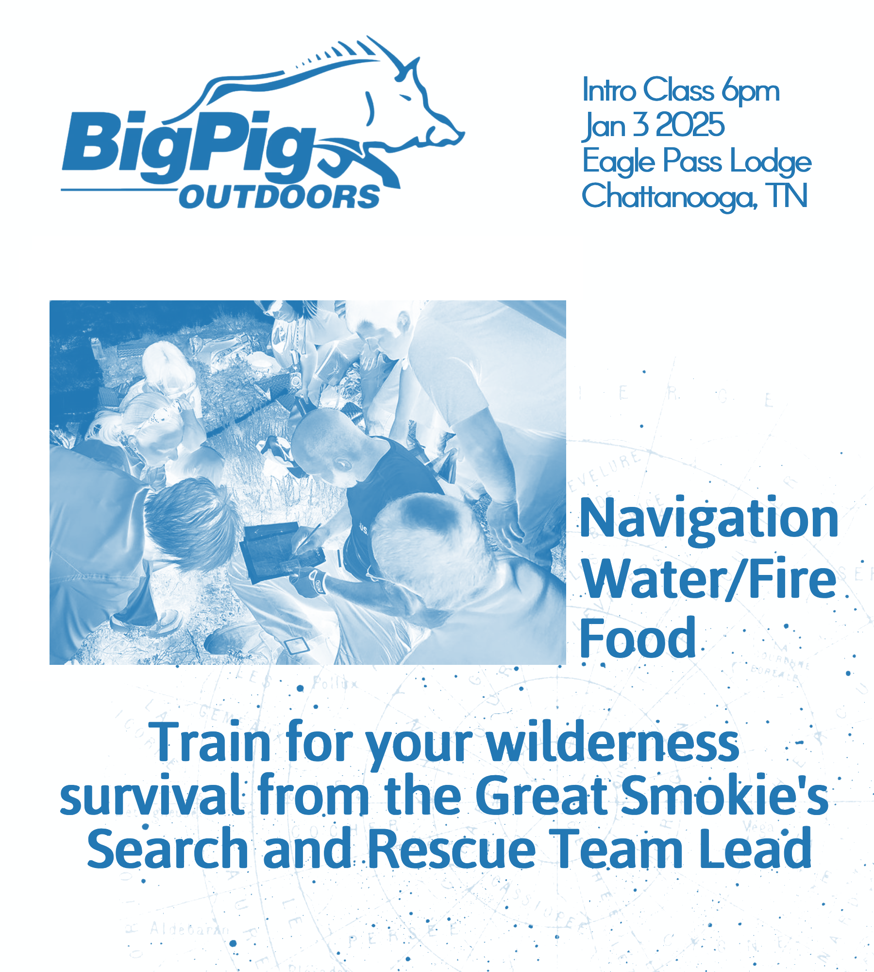
Case Study: Team BUSAR and BigPigOutdoors
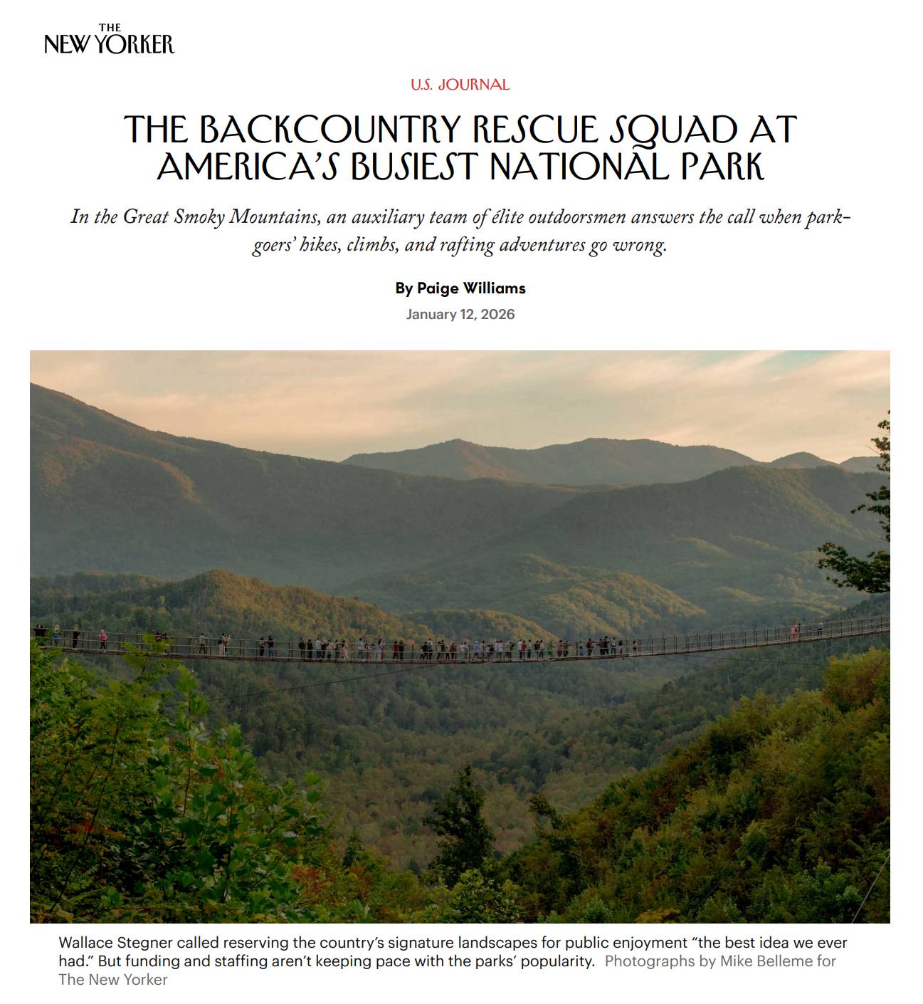
Designed a cohesive visual identity and digital presence for an outdoor lifestyle brand across branding, web design, and social media. The system focused on clarity, rugged-modern aesthetics, and consistent visual storytelling across platforms.
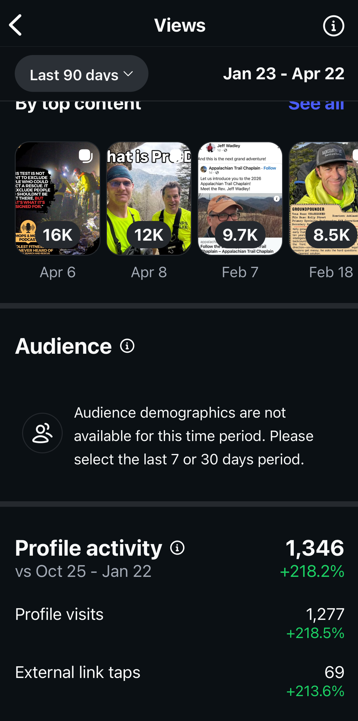

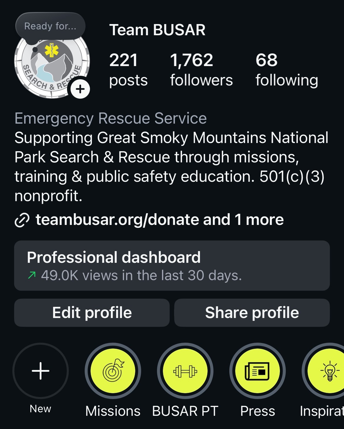
Role:
- Developed brand identity including typography, visual direction, and overall aesthetic system
- Designed and structured website with focus on usability, hierarchy, and cohesive brand expression
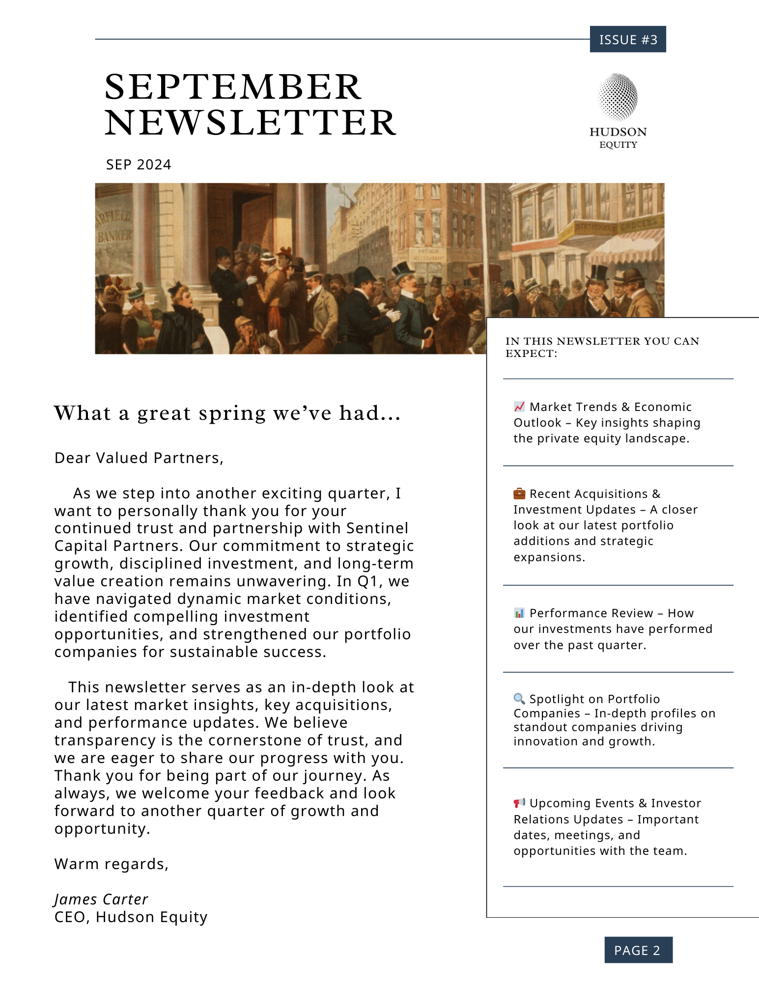
- Created social media content system with templates and visual guidelines for consistent output
Outcome: Delivered a unified brand presence across web and social platforms, improving visual consistency and establishing a clear, recognizable identity.
Big Pig Outdoors needed more than a logo or website. It required a cohesive visual system that could work across outdoor settings, digital platforms, and social content while maintaining a clear and consistent identity.
The goal was to create a brand that felt grounded in utility but still modern and visually distinct within a crowded lifestyle market. The system needed to balance durability with a refined, editorial edge.
The solution included identity development, a structured website design focused on clarity and hierarchy, and a social media system built from reusable templates and visual rules to ensure consistency across all content.

TouchWood Editions
Editorial & Book Design
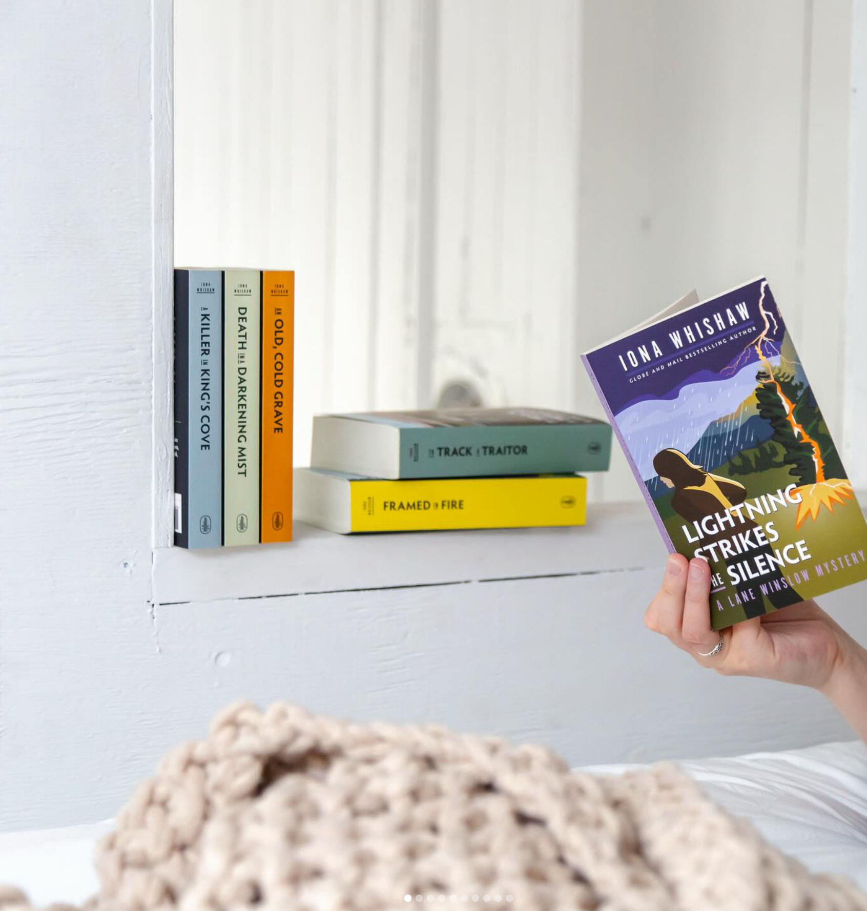
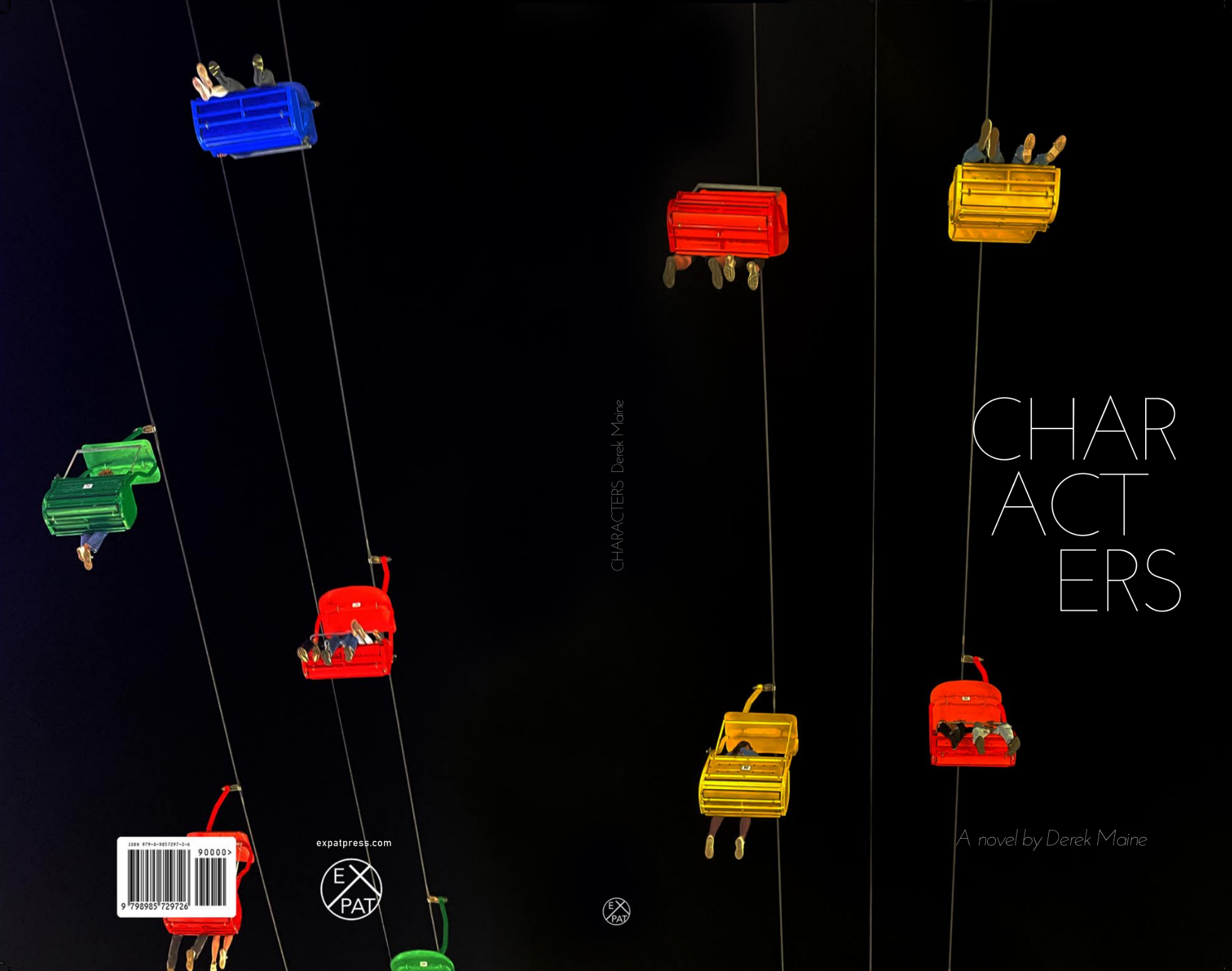
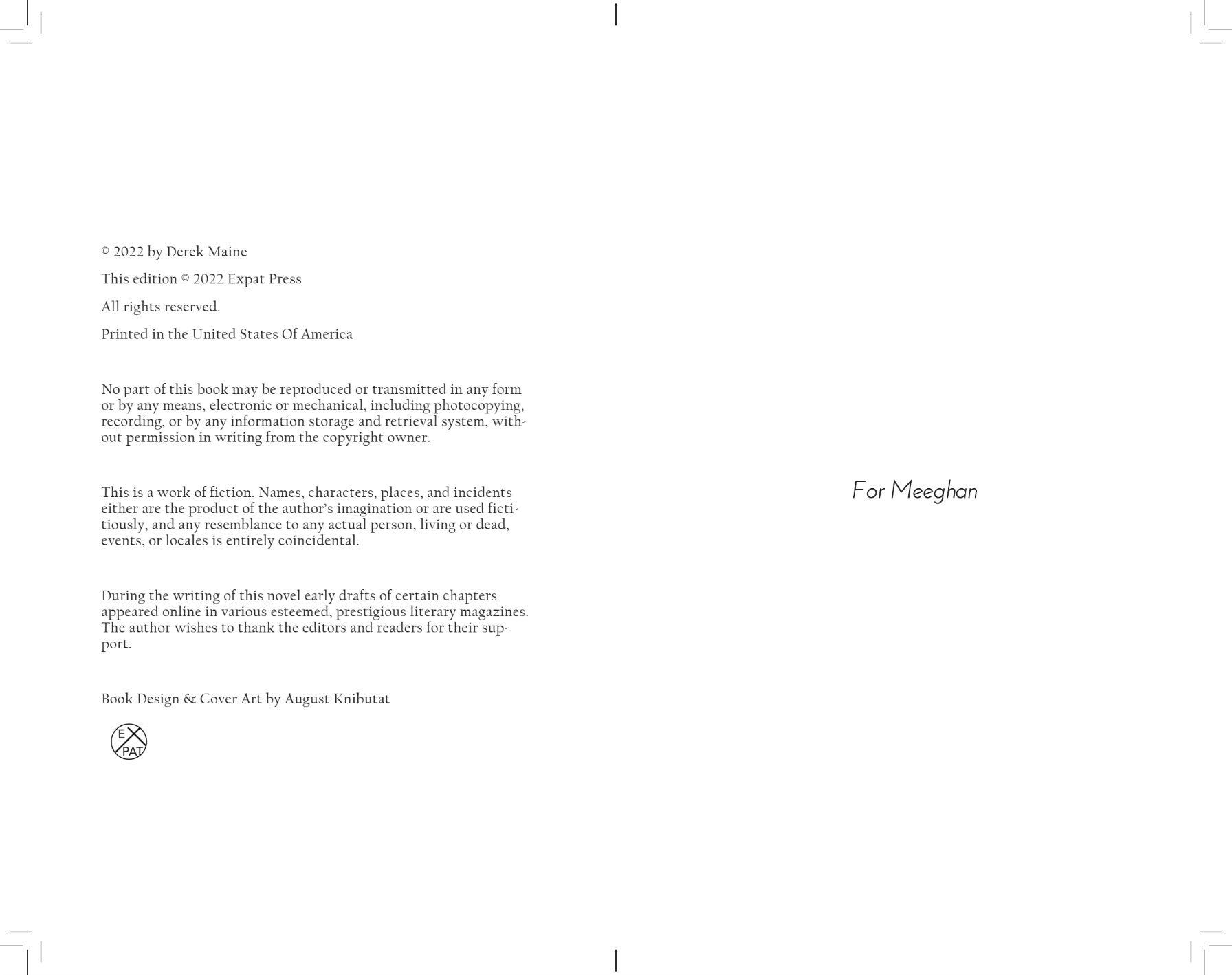
Created manuscript layout and book interior for a published title, focusing on typographic hierarchy, readability, and print-ready formatting. Developed a cohesive editorial system aligned with publisher standards and long-form reading experience.
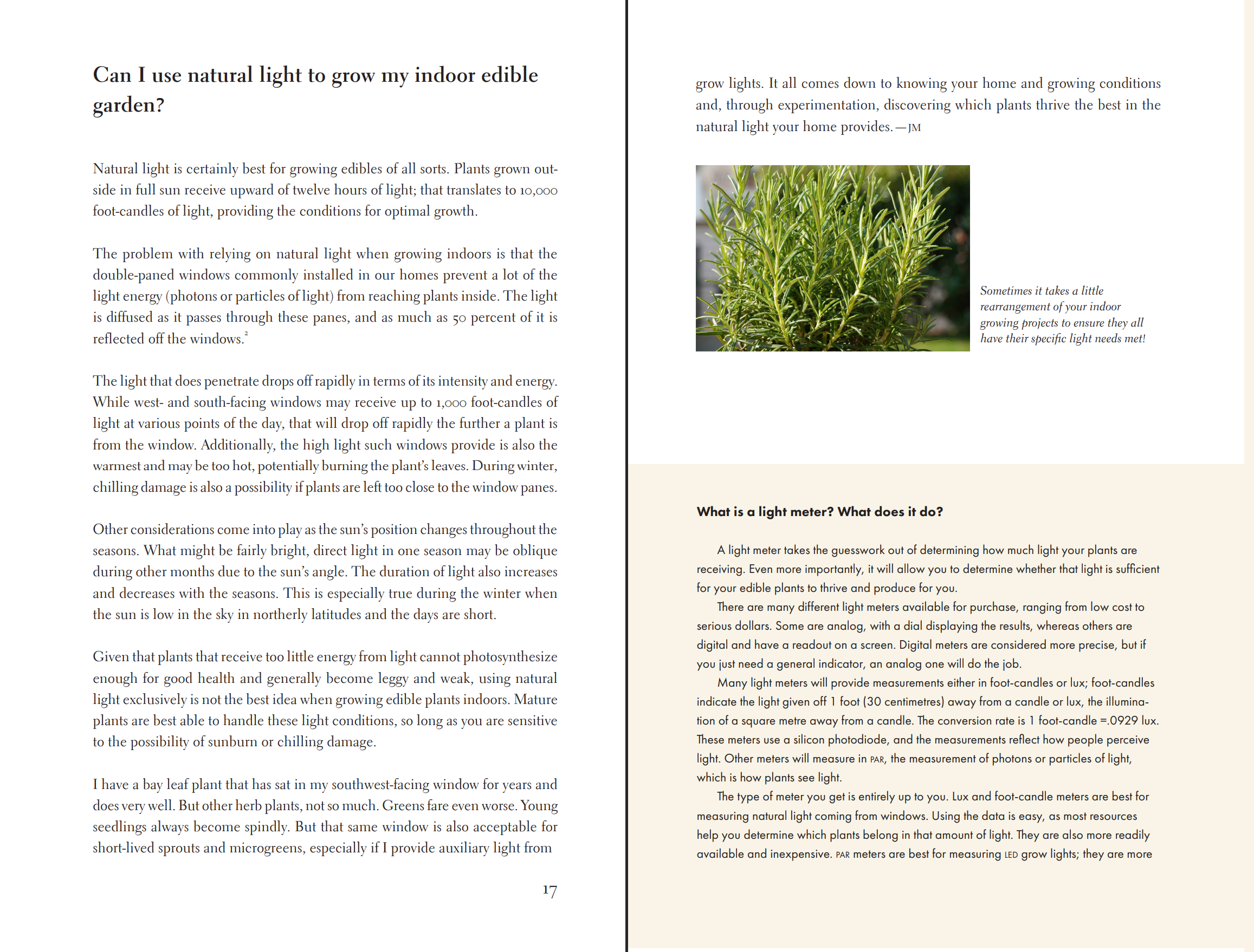
Role:
- Designed manuscript layout system including margins, typography, and page hierarchy
- Selected and implemented typefaces optimized for long-form readability
- Prepared print-ready files aligned with publishing standards and production requirements
Outcome: Produced a cohesive, readable book interior that supports long-form engagement and meets professional publishing specifications.
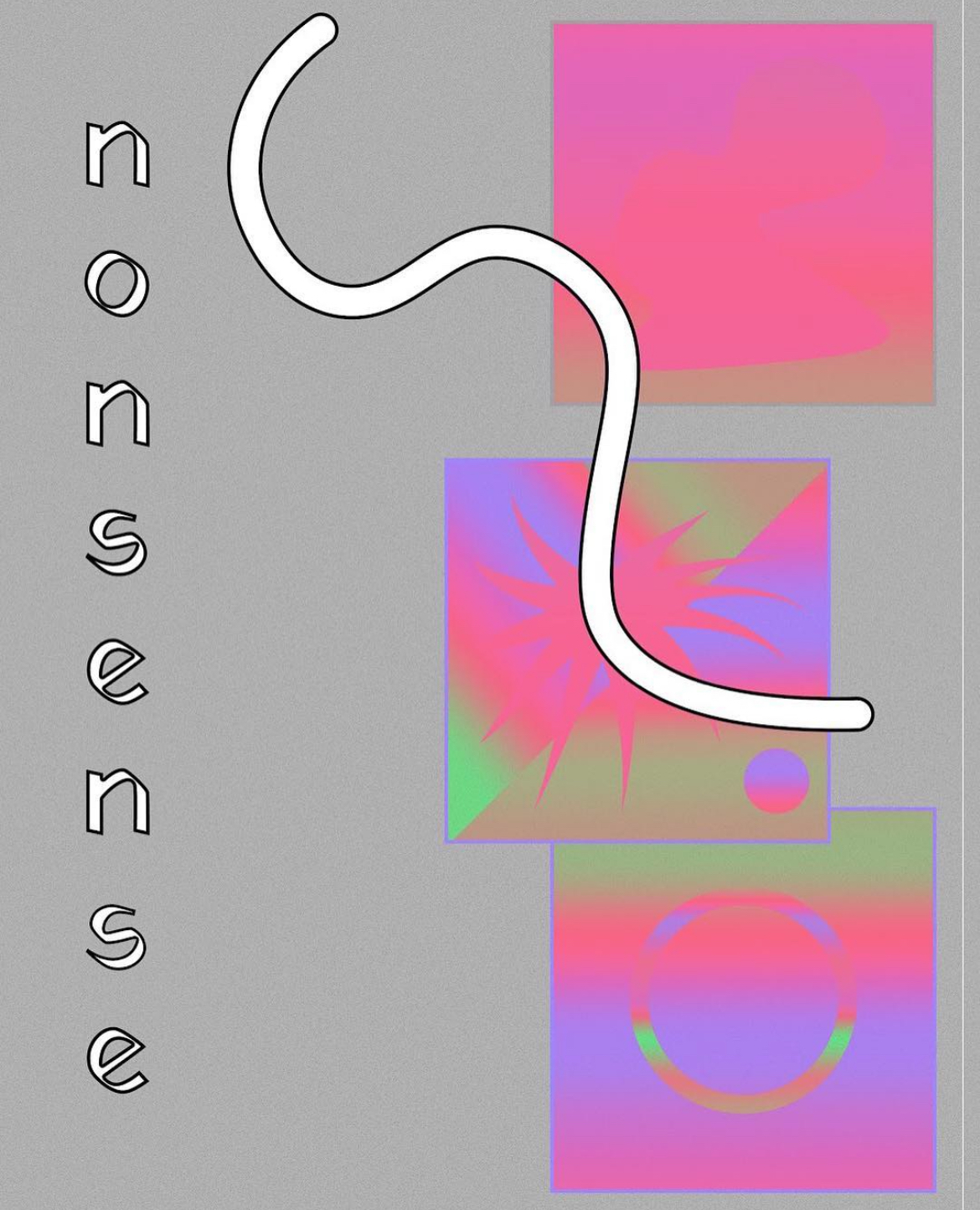
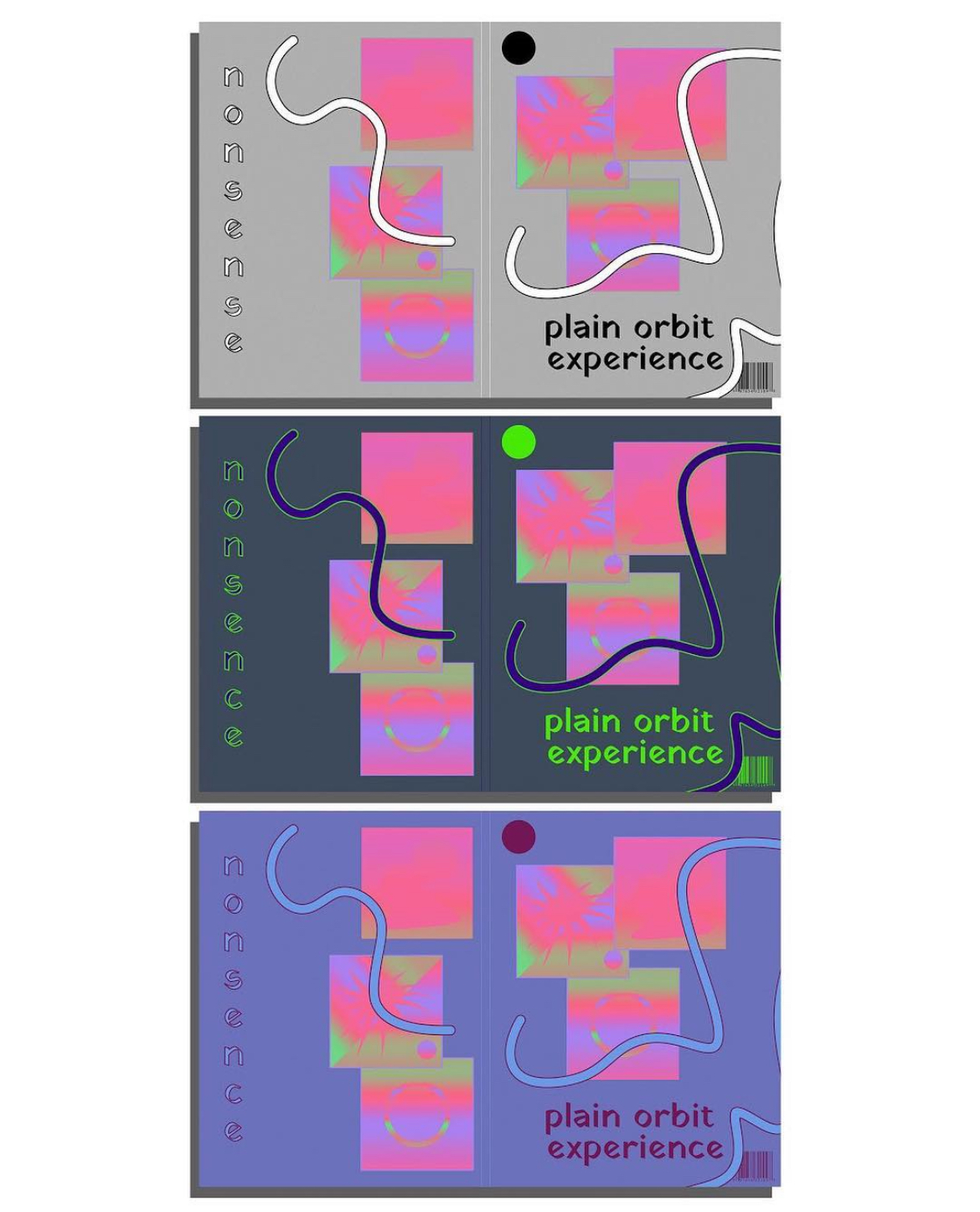
Book design operates under a different kind of pressure than most visual work. It is not meant to capture attention quickly, but to sustain it: quietly, consistently, over hundreds of pages.
For this project with TouchWood Editions, the task was to translate a manuscript into a readable, durable, and visually coherent object. The design needed to disappear just enough to support the text, while still establishing a clear typographic voice.
The process centered on building a stable layout system: margin structure, line length, spacing, and hierarchy were carefully calibrated to reduce fatigue and guide the reader through the text. Typography choices were made not for novelty, but for rhythm and legibility over extended reading.
The result is an interior design that supports immersion: structured, restrained, and aligned with contemporary publishing standards. Every element serves the same goal: to let the reader remain inside the work without interruption.
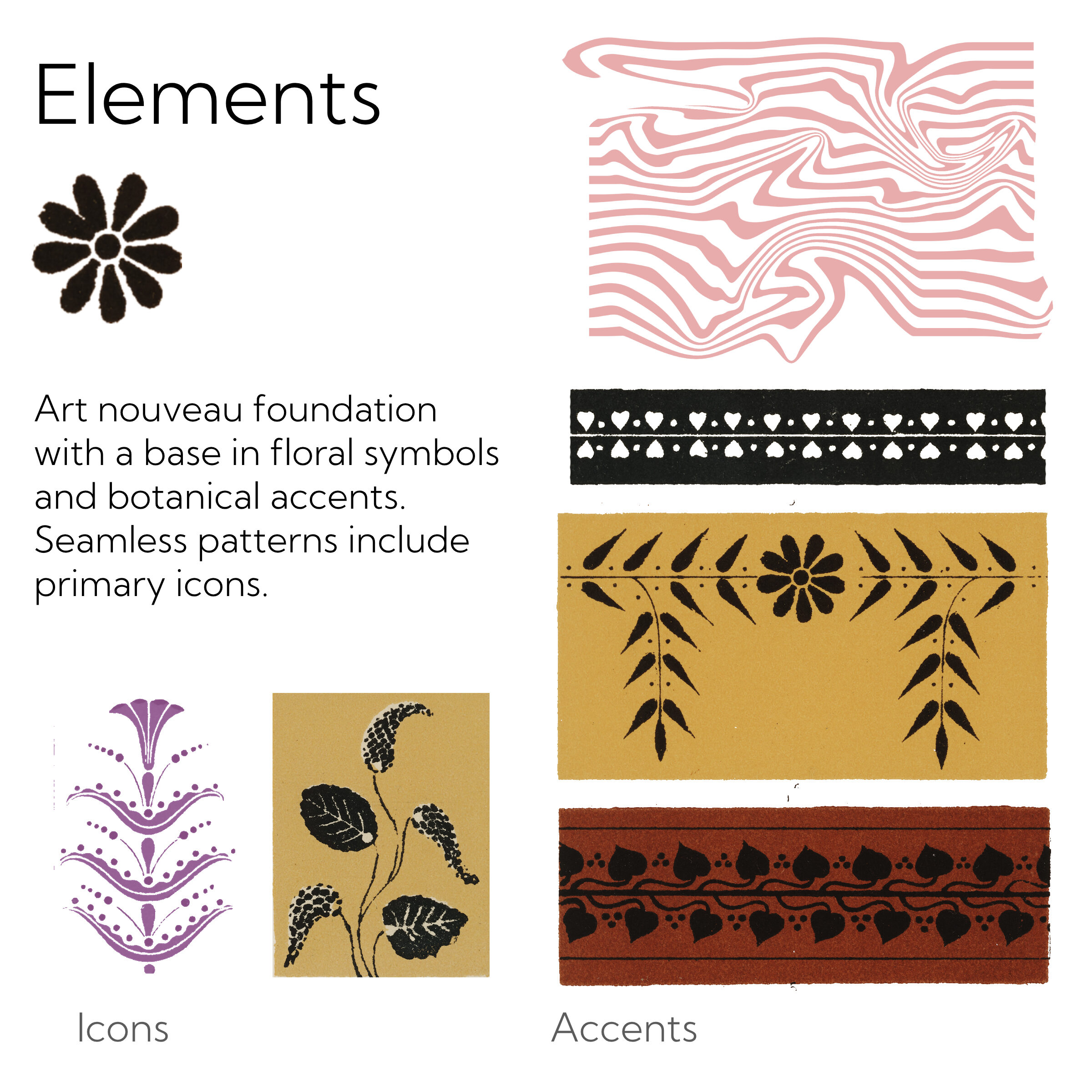
Freelance Clients
Branding & Visual Identity
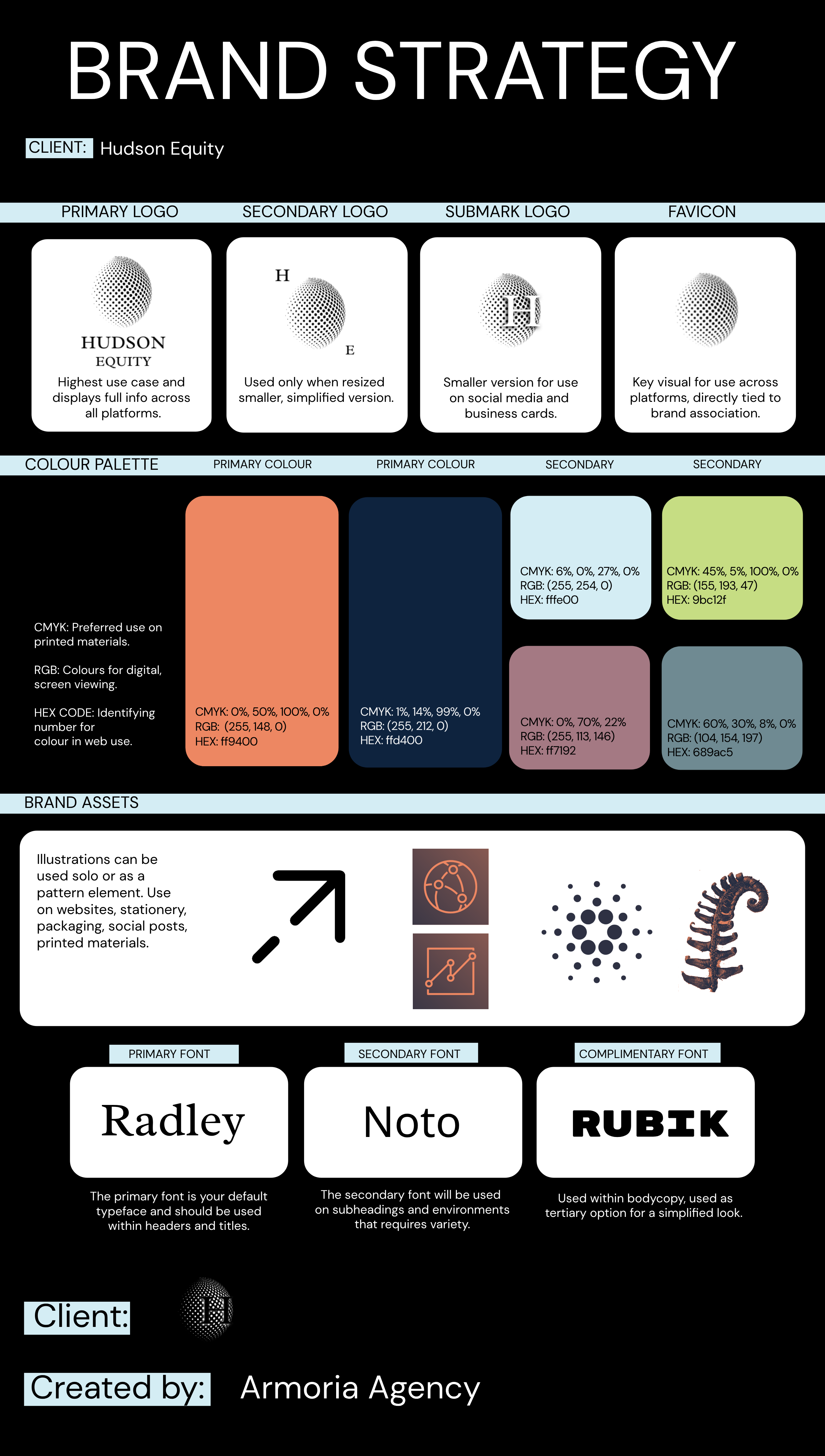
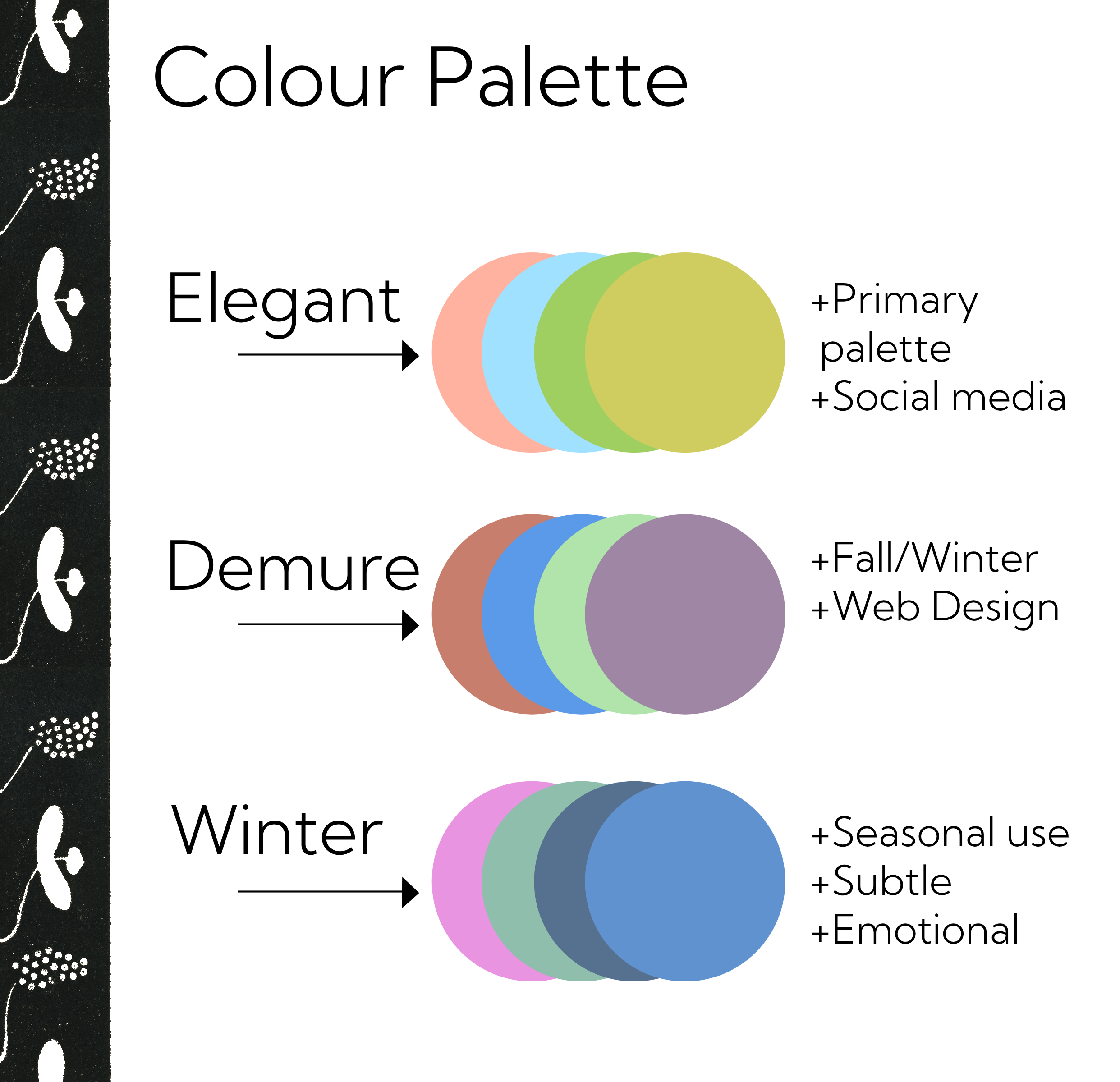
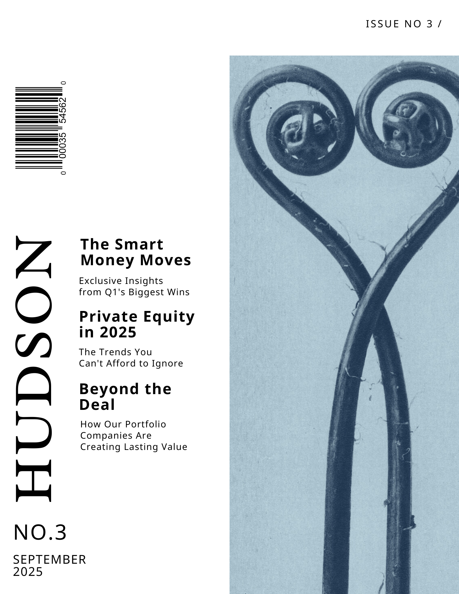
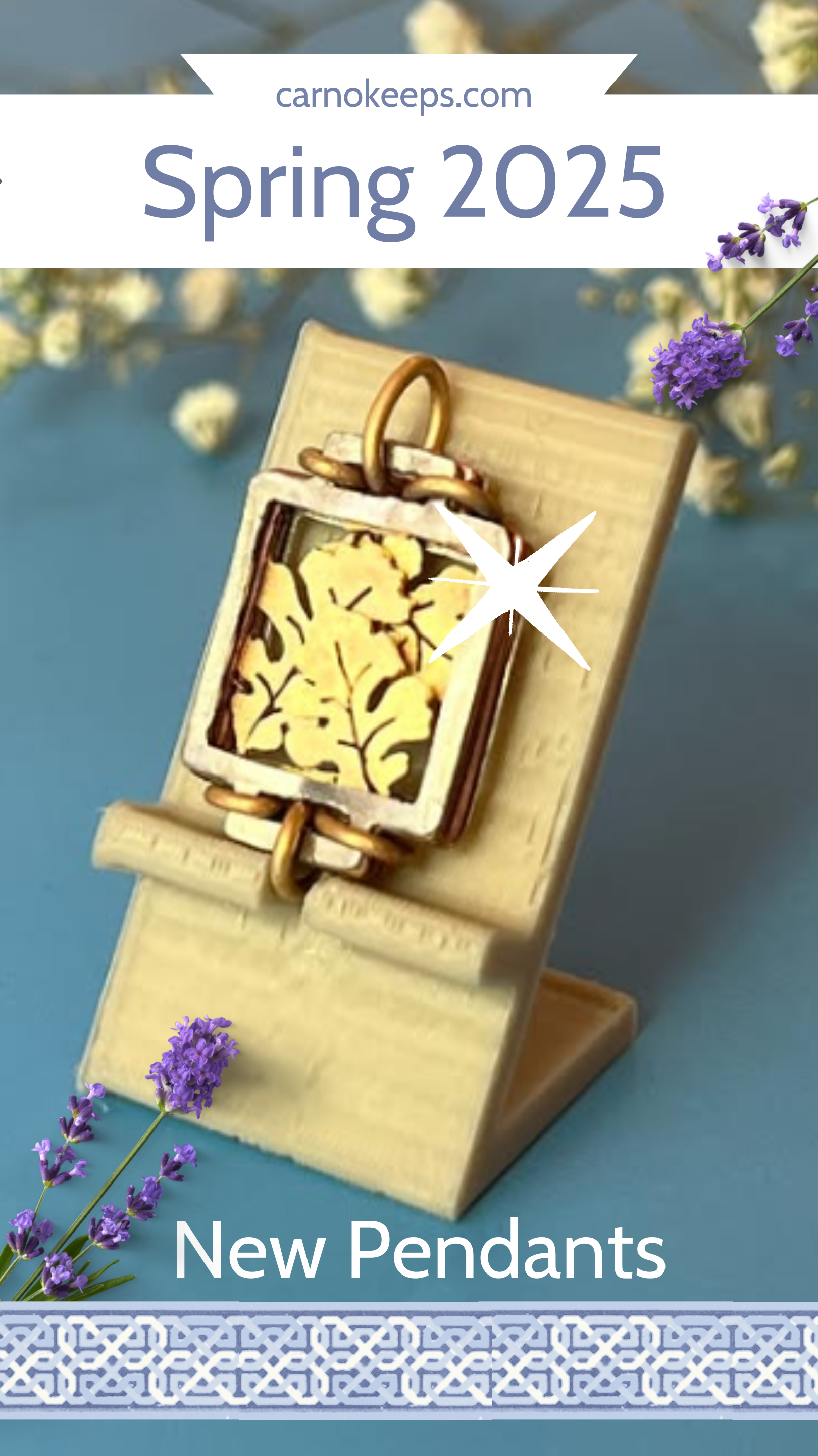
Developed brand identities and visual systems for independent clients across lifestyle, creative, and small business sectors. Work included logo design, typography, and cohesive visual direction across digital and print applications.
Role:
- Developed brand identities including logos, typography systems, and visual direction
- Created adaptable design assets for digital and print applications
- Collaborated with clients to translate concepts into clear, functional visual systems
Outcome: Established flexible, cohesive brand systems tailored to each client, enabling consistent use across platforms and improving overall visual clarity.
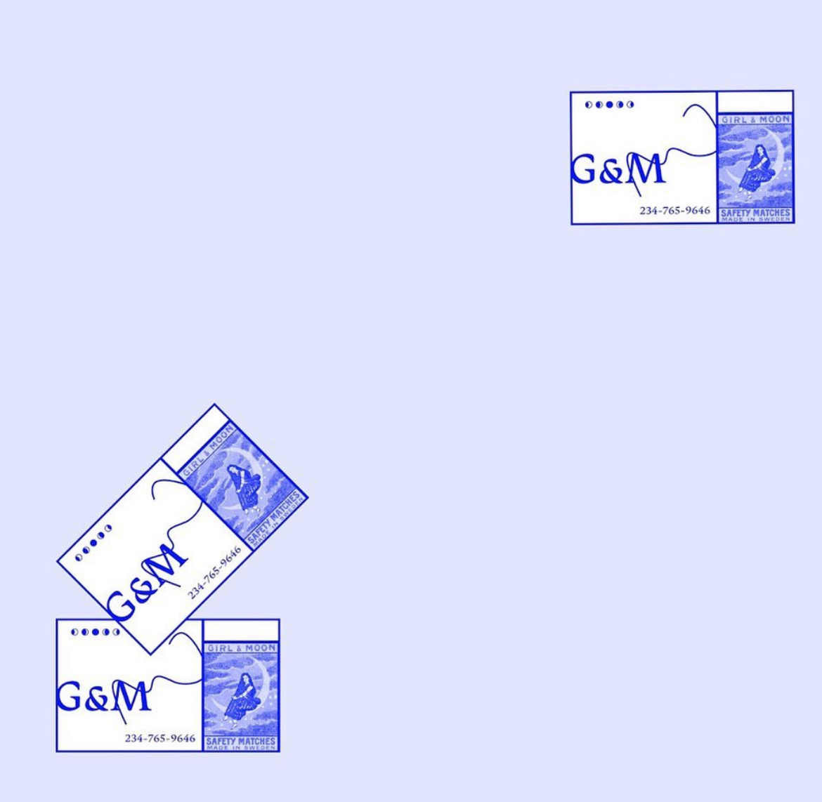
Freelance branding work requires a balance between adaptability and consistency. Each client brings a different context—industry, audience, and aesthetic preference—but the underlying challenge remains the same: to create a visual system that is both distinct and functional.
Across multiple independent projects, the focus was on developing identities that extend beyond logos into usable systems. This included defining typography, color structure, and compositional rules that could scale across platforms—from social media to web to print.
Rather than treating each deliverable as a standalone piece, the work emphasized cohesion. Visual decisions were made in relation to how the brand would live over time: how it would appear repeatedly, how it would be recognized, and how it could maintain clarity across different formats.
The result is a series of brand systems that are flexible, recognizable, and aligned with each client’s positioning—designed not just to look consistent, but to function consistently in real use.
Book




Branding




Marketing
Social Media


Typography


CLIENTS






augustkni@gmail.com
© AUGUST KNIBUTAT